Nice. GGRA's looks very good too. Thanks again. Later.

You are using an out of date browser. It may not display this or other websites correctly.
You should upgrade or use an alternative browser.
You should upgrade or use an alternative browser.
T-Shirts
- Thread starter zl900_moab
- Start date
Nice. GGRA's looks very good too. Thanks again. Later.
I like that too - but prefer the outline rather than the pic of the bike. Just needs zl-oa.com on it.
Prostreet
Well-Known Member
I agree with Prostreet, I think Kawasaki needs to be on there somewhere. I tweeked the location though.
I also mocked up a design for fun. I scanned my patch and cropped off the text and picture and played around with the pieces.
Thanks for bringing this up Moab, I will definitely take one!
I had that front kawasaki as my second choice. I do happen to like what Moab did with the back, though. The front is perfect...just needs the kawasaki word in there.
I'm wondering if anyone else thinks the 'bad news travels fast'
is a bit too large on the back?
I think it makes the shirt, its just so big.
I really like the front, especially with the 'by kawasaki'.
is a bit too large on the back?
I think it makes the shirt, its just so big.
I really like the front, especially with the 'by kawasaki'.
zlMark
Cult Leader
Here's what I'm picturing.....
On the front:
ZL-OA.COM all caps or preferably a copy of the outline I use in the site header (i have) small placed on the left breast
The back:
Kawasaki across the top done with correct kawasaki red lettering found on www.kawasaki.com then the zl900 silhouette with the "Eliminator" script in it lowered from what I have seen.
rkerg
Senior Member
I agree with Prostreet, I think Kawasaki needs to be on there somewhere. I tweeked the location though.
I also mocked up a design for fun. I scanned my patch and cropped off the text and picture and played around with the pieces.
Thanks for bringing this up Moab, I will definitely take one!
A lot of good ideas. Whatever you finally decide, I want one.
Last edited:
GGRA
Well-Known Member
I agree with ZLFancypaint, the "Bad News Travels Fast" should be smaller. I kind of like Mark's idea too.
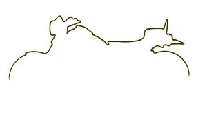
Does anyone have a copy of the silhouette they can post?
Does anyone have a copy of the silhouette they can post?
zlMark
Cult Leader
I have a shot of the kawasaki logo attached.Here's what I'm picturing.....
On the front:
ZL-OA.COM all caps or preferably a copy of the outline I use in the site header (i have) small placed on the left breast
The back:
Kawasaki across the top done with correct kawasaki red lettering found on www.kawasaki.com then the zl900 silhouette with the "Eliminator" script in it lowered from what I have seen.
Suggestion for new site slogan:
Instead of Kawasaki's "Let the good times roll" how about "Lets Roll a Good Time!"
 I know Blag and Lowlife will like it!
Attachments

Prostreet
Well-Known Member
Mark That is what i was intending for the red lettering, but couldn't find it. (but with out the let the good times roll) otherwise thats what should be on the front.
zlMark
Cult Leader
Poor silhouette for ya. Later.
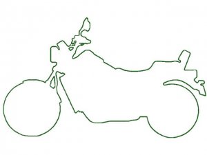
Does anyone have blagadans silhouette with the wheels connected?
i have a few silhuettes, but nothing with wheels connected ! SORRY ! CHRIS
Stormy
Senior Member
- Joined
- Oct 13, 2006
- Messages
- 844
- Reaction score
- 1
...just to throw a spanner in the works, how's this for the front of the shirt.

Prostreet
Well-Known Member
Wow! I'm very impressed. Great job, Stormy!
zlMark
Cult Leader
...just to throw a spanner in the works, how's this for the front of the shirt.
Looks familiar
Stormy
Senior Member
- Joined
- Oct 13, 2006
- Messages
- 844
- Reaction score
- 1
I'm not taking credit for that image, I think it was Rick_in_WA's, but I just thought I'd throw it in for argument's sake.
I still have all the concept images from when we were deciding on the final layout for the patches, including all the "Eliminator" and zl-oa.com script's, fonts, bike images (ZL900 & ZL1000), "Kawasaki" OEM script, plus heaps more concept designs for stickers, etc, that everyone here had forwarded for consideration.
If anyone wants those images to get their creative juices flowing, they are welcome to use them.
Mick.
Last edited:
slash
Active Member
- Joined
- Mar 15, 2008
- Messages
- 9
- Reaction score
- 0
i would be in for a couple shirts!
DSBeav
Active Member
I'd like this for the front of the shirt. I'd be up for a few of these.
Prostreet
Well-Known Member
Beautiful!
Last edited: